
Alpaca Brand Evolution
Turning a playful fintech identity into a global financial infrastructure brand.
Role
Lead Brand & Visual Designer
Scope
Logo redesign, visual system exploration, initial brand guidelines
Timeline
6 weeks
Team
Founders, Head of Marketing, 2 Visual Designers, 200+ Team Feedback
Context
From Friendly Fintech Startup to Global Brokerage Infrastructure
Alpaca is a Silicon Valley fintech company building API-first brokerage infrastructure that enables businesses and developers to create investing products.
As the company expanded from a developer-focused brokerage API into a global financial infrastructure provider, its brand needed to evolve with its ambitions.

The Challenge
The original identity captured Alpaca’s approachable personality but was designed for an early startup stage. As Alpaca grew into serving:
fintech companies
institutional partners
global markets
the brand needed to communicate:
Trust + Technology + Scalability
while preserving its core differentiation:
Human + Accessible + Developer-friendly
The Transformation
The redesign moved Alpaca from a literal mascot-driven identity toward a more modern technology symbol.
Key changes:
Simplified Symbol
The alpaca became more abstract and geometric, creating a mark that could scale across:
API platforms
documentation
products
enterprise communications
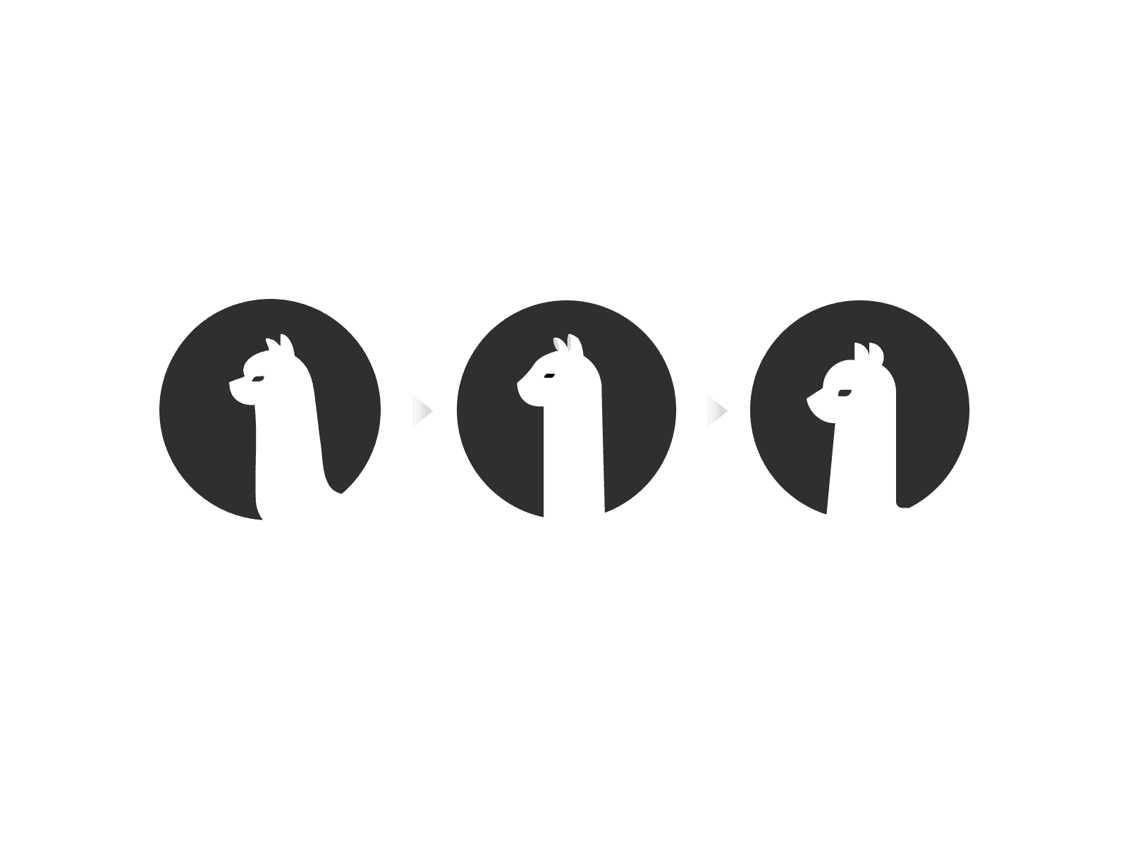
More Precise Visual Language
The sharper construction reflected Alpaca’s shift toward:
infrastructure
reliability
engineering excellence

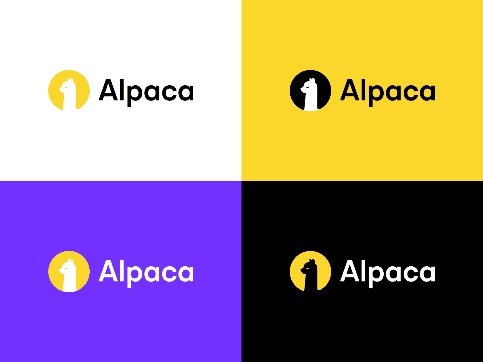
New Color Direction
The introduction of purple positioned Alpaca away from traditional financial branding and toward innovation and emerging technology.
Outcome
The redesign supported Alpaca’s broader business evolution from brokerage API provider into a multi-asset financial infrastructure company.
Between 2022–2025, Alpaca expanded:
asset classes
regulatory capabilities
global partnerships
institutional reach
The brand survived because it did not remove the personality behind “Alpaca”; it transformed it into a more scalable identity.
Key Insight
Alpaca’s redesign was not about making a fintech brand look more serious. It was about making a playful name credible enough to power serious financial infrastructure.