
Tablox
A small experiment in browser clutter, attention, and gentle intervention
Role
Product Designer · Researcher
Scope
Research, UX, Interaction Design, Prototyping
Timeline
September 2026
Team
Solo + AI-assisted development
Context
Tablox (https://gettablox.github.io/) is a lightweight browser extension that makes tab accumulation visible without forcing users to close tabs.
The idea came from a simple observation: tabs often become reminders, unfinished tasks, research trails, and things we don't want to forget. Over time, the browser can become an external memory system.
Research on tab overload points to possible drivers such as unfinished tasks, fear of forgetting, and using tabs as reminders. The Zeigarnik effect (the tendency for unfinished tasks to remain mentally salient) is sometimes discussed in this context, although it would be too strong to claim it directly explains tab hoarding.
The design question
The obvious solution was to impose a limit: close a tab before opening another. I deliberately rejected that approach because many tabs can be legitimate.
Instead, I wanted to test whether making accumulation visible could encourage awareness without removing user control.
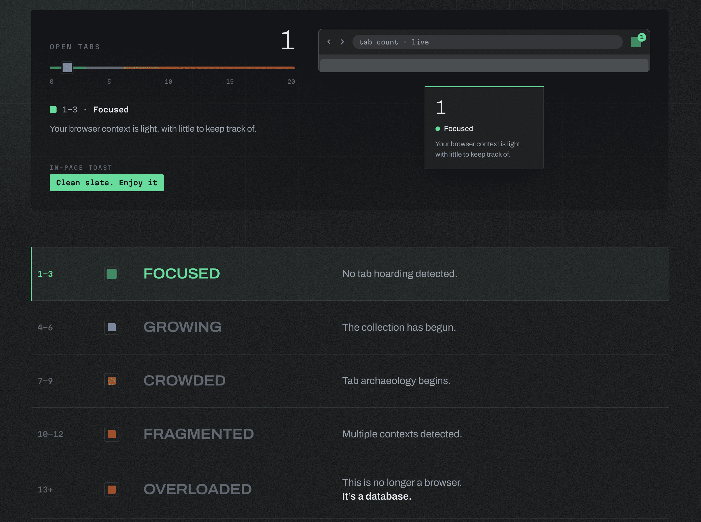
Tablox uses progressive feedback rather than blocking:
Tabs | State | Color |
|---|---|---|
1–3 | Focused | Green |
4–6 | Growing | Blue |
7–9 | Crowded | Yellow |
10–12 | Fragmented | Orange |
13+ | Overloaded | Red |
The messages are deliberately playful, moving from “Clean slate. Enjoy it.” to “This is no longer a browser. It's a database.”
Why these colors?
The color progression draws from the familiar safety-color conventions of ANSI Z535, particularly ANSI Z535.1 for safety colors and ANSI Z535.2/Z535.4 for signs and labels. Similar conventions are recognized by OSHA under 29 CFR 1910.145.
Tablox isn't a safety system, and the thresholds aren't claims about cognitive overload. The standard simply provided a familiar visual language for increasing levels of attention.
An affordance, not a block
I wanted Tablox to act as an affordance (a cue that suggests an action), not a productivity enforcement mechanism.
The extension doesn't decide that 13 tabs is “too many.” It simply makes accumulation harder to ignore, leaving the decision with the user.
The hypothesis is modest: perhaps a small environmental cue can help people notice their browsing behavior and decide whether to change it.
Building the first version
The prototype was built with OpenCode + Big Pickle, using standard browser technologies and GitHub. The experiment was effectively zero-cost.
That constraint was useful. For a low-stakes idea, free AI-assisted development was enough to move from hypothesis to working software without first building infrastructure or a large development process.
AI didn't replace the design work; it lowered the cost of testing the idea.
What I learned
Early feedback showed that the intervention itself needs to remain configurable. Some users wanted to disable the toast notifications, leading to the next iteration: settings for controlling or switching them off.
This reinforced an important principle: an attention aid can easily become another source of distraction.
An ongoing experiment
Tablox is not a validated measure of attention, cognitive load, or productivity. Tab count is simply an observable behavioral proxy, and context matters.
I'm treating the project as a continuous design-research experiment into how software can support attention without taking control away from the person using it.
The question isn't “How do we stop people from having too many tabs?”
Can software help us notice when our digital environment is becoming scattered, without deciding for us what to do about it?